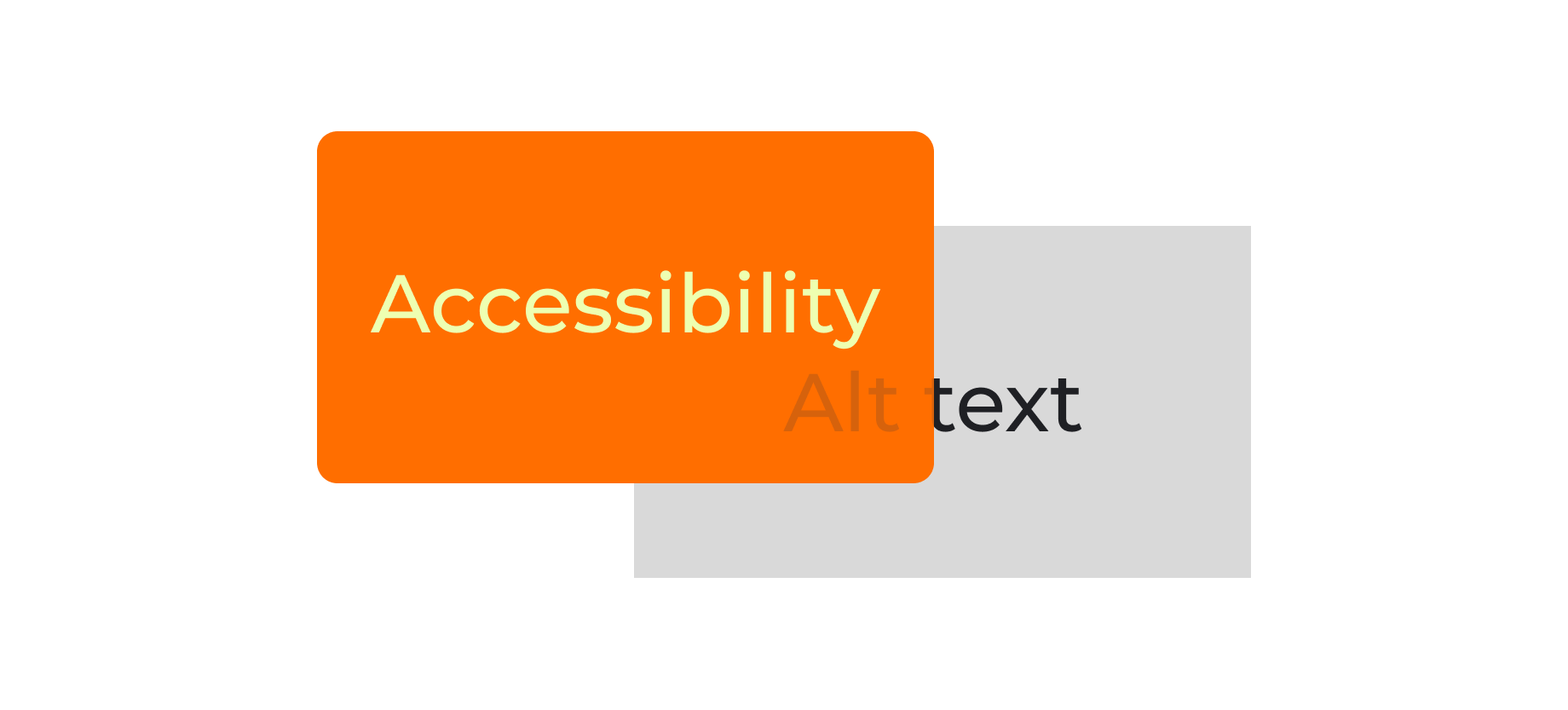
Accessibility
One H1 per page and don’t skip heading levels. Webflow recommends sequential heading order and the Audit panel can flag issues.
Every meaningful image gets alt text while decorative visuals get treated as decorative.

Animation Tokens
Duration tiers: .5 seconds, 2 seconds, 10 seconds.
Easing: none.
What animates: nav dropdowns, hover underline, section reveals.
For interactions, .5 seconds with no easing provides feedback without having a sensation of lag.
For the video animations, the total duration is 10 seconds with each non-video segment at 2 seconds. While providing some intrigue through visuals, provides a quick glance at the organization the portfolio case study relates to while also provides context on projects introduced within.

White - #FFFFFF

activeBlack - #1a1b1f

inactiveGrey - #32343a

Orange - #ff6e00

highlightRed - #ffc7c7

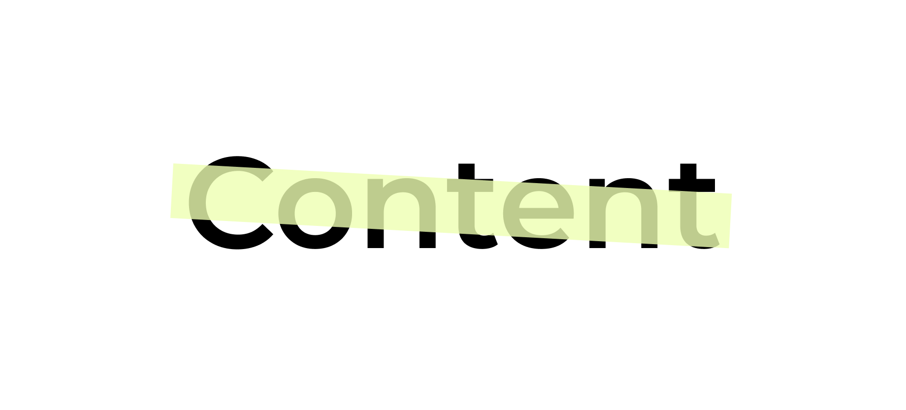
highlightYellow - #eeffb1
Color Tokens
When putting together my portfolio, I was deciding on colors to utilize and I scrolled over 'highlightYellow'. It seemed like a overpowering at first glance but I really like the highlighter effect it produces when paired with copy or within interactive elements. I used a similar text effect within the box art of Ugly Pickle and the color also reminds me of the color of pickleballs. highlightYellow must always be paired with a darker color in order to pass contrast accessibility standards.
HighlightRed and orange were accents chosen to pair with highlightYellow in order to produce colors with higher contrast for standalone use. These colors are split complimentary to highlightYellow.
activeBlack is not #000000 because it was shunned back in design school for not looking good on prints and screens.
Components

Header
The header contains the logo and top navigation buttons. All of the elements are interactable and will forward you to different pages of the website.

Footer
Similar to the header, the footer serves as a way to forward the user to other related content. The only exception is the email link which prompts the user to submit an email. Interacting with the email link open the email service popup in another window/tab.

navBar
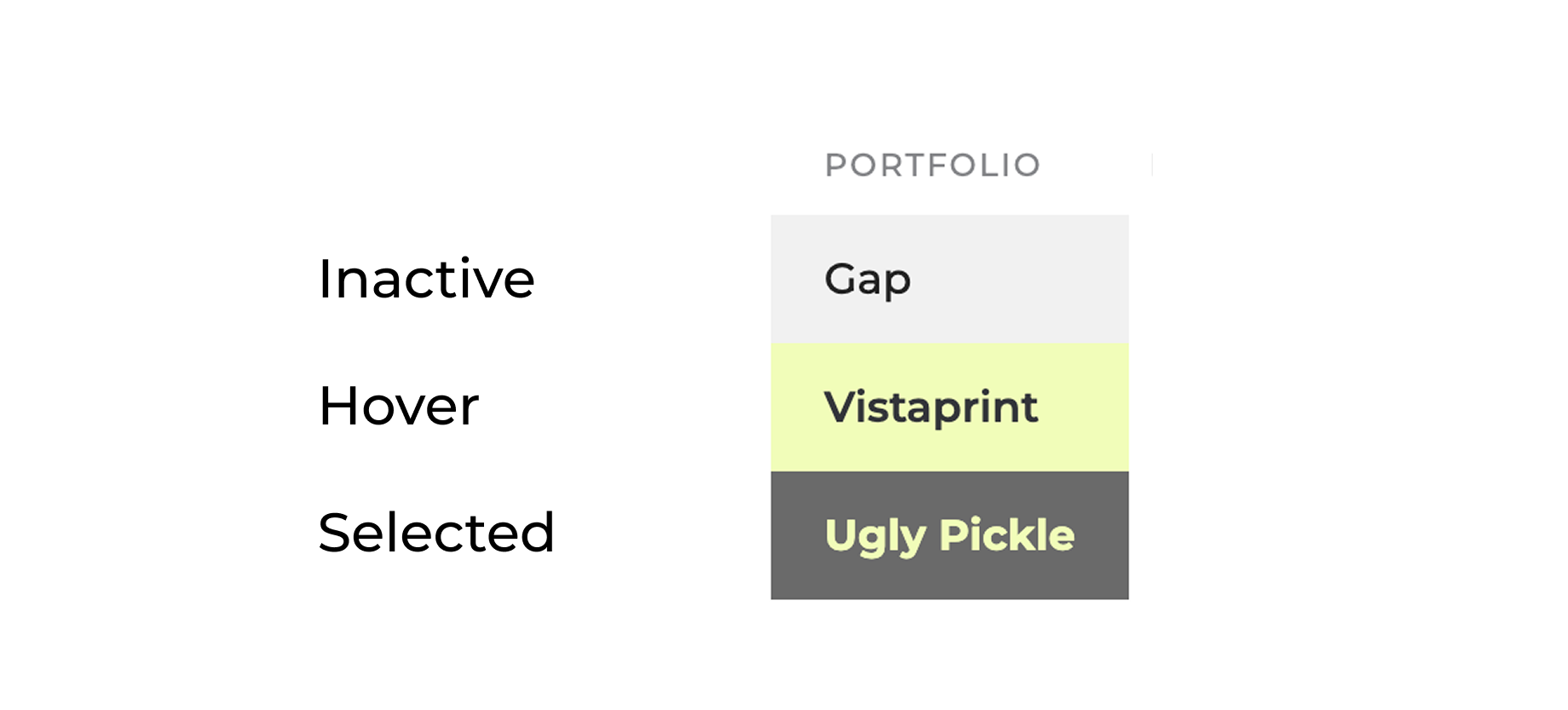
the navBar serves as the main function to browse around the portfolio content. Within each text link are default, hover, and current state variants to indicate where you're located within the sitemap and to provide feedback on which of the items you're selecting.

Section header block
The section header block contains a text block containing the title and small descriptor. It contains the H1 of the page for better indexing purposes.

Badge list
These pills show key terms so you can scan the skills used in the project at a glance. Since they are not interactive, they use a muted background so they read as labels, not something to tap.

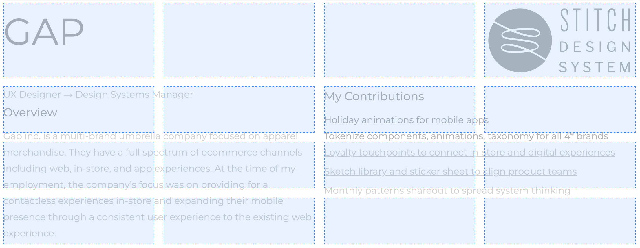
Case study block
This content block provides an overview, contributions and optionally an image to help define the type of company and the product worked on.
Cards
At the bottom, along with the footer - the card provides a description and title focused on priming the user to the next portfolio case study. By providing a CTA, it enables the view to seamlessly transition from case study to case study without having to go to the top of the page.
Call to action
The most important component of any page, the call to action allows the user to interact with the most coveted concept of the page. The three types of interactions are to: guide the user to one of three portfolio pieces, to take you to a next portfolio piece and to download the resume.
Content Guidelines
I use this content guide to keep my portfolio consistent and easy to scan. I lead with the point, keep paragraphs tight, use plain language, and cut anything that feels like filler. Every case study follows the same structure so you can get oriented fast: what it is, what I owned, why it mattered, the problem and constraints, how I approached it, the key decisions I made (and the tradeoffs), how I worked with partners, what shipped, and what I would improve next. For documentation pages like components, patterns, and templates, I treat them like a source of truth. I spell out the purpose, the anatomy, behavior and states, content rules, accessibility, responsive rules, and real examples, plus simple do and do not guidance. Screenshots need to earn their spot with a one sentence caption that tells you what to notice, and if I cannot show sensitive work, I will still show the thinking with simplified diagrams or clean artifacts. The goal is a portfolio that reads the same way I work: clear, direct, accessible, and built to scale.
Grid
Portfolio Section headers: 4x 1FR Columns per breakpoint


Image and Content sections: 4x 1FR Columns per breakpoint
Layout rules for case study pages: image sizing + text column width
Gutter 40px
Exceptions to grid structure: oversized image/video, hero animation (which just used center justified)
Iconography
Link icons
Maximum width & height 40px
Control Icons
Stroke weight consistency 8px

Image Selection
I choose images that make the project easier to understand and either relating or to provide context for the content.
I avoid images that exist only for vibe or decoration.
Restricted to less than 4mb per image to reduce load times.
Logo
Variants (icon, favicon)
Minimum interactive size: 40px
Logo can be used in both dark and light usage

Motion Principles
States: Every interactive element must have: Default / Hover / Focus / Pressed (at minimum). “Current page” styling should not rely on hover-only effects.
Navigation
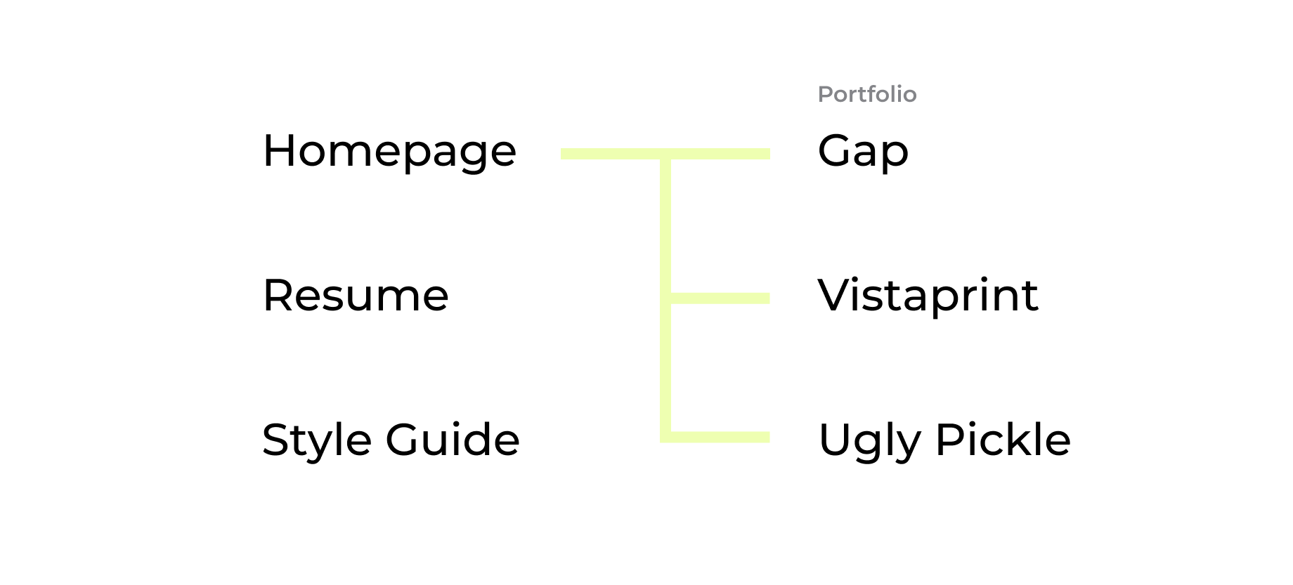
IA (top-level + portfolio children)
Current-state behaving dropdown parent behavior)
Patterns
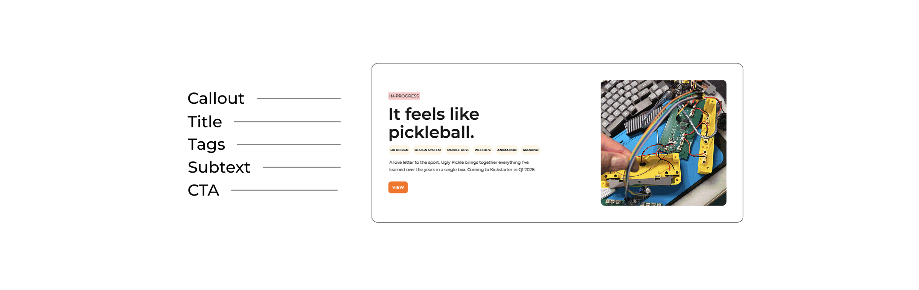
A portfolio card should be easy to understand and easy to click. The whole card is clickable, it includes a thumbnail for quick context, a clear project title, a short line that explains what it is and why it matters, and a few tags or details like role and skills. Hover and focus states should simply show it’s interactive. On smaller screens, cards stack into one column, keep spacing readable, and avoid jumping around while images load.
A case study template keeps every project page consistent and easy to scan. It starts with a short overview that explains what the project is, what I owned, and why it mattered. Then it covers the problem, constraints, and the approach I took. After that, it highlights the key decisions I made and the tradeoffs behind them, how I worked with partners, and what shipped. It ends with outcomes and a brief note on what I would improve or explore next.

Radius
I choose 24 as my corner radius of choice for this portfolio. I chose 24 because it's divisible and an even number in case if I ever want to create permutations of components in the future. I only use it on cards in order to create a visual distinction.
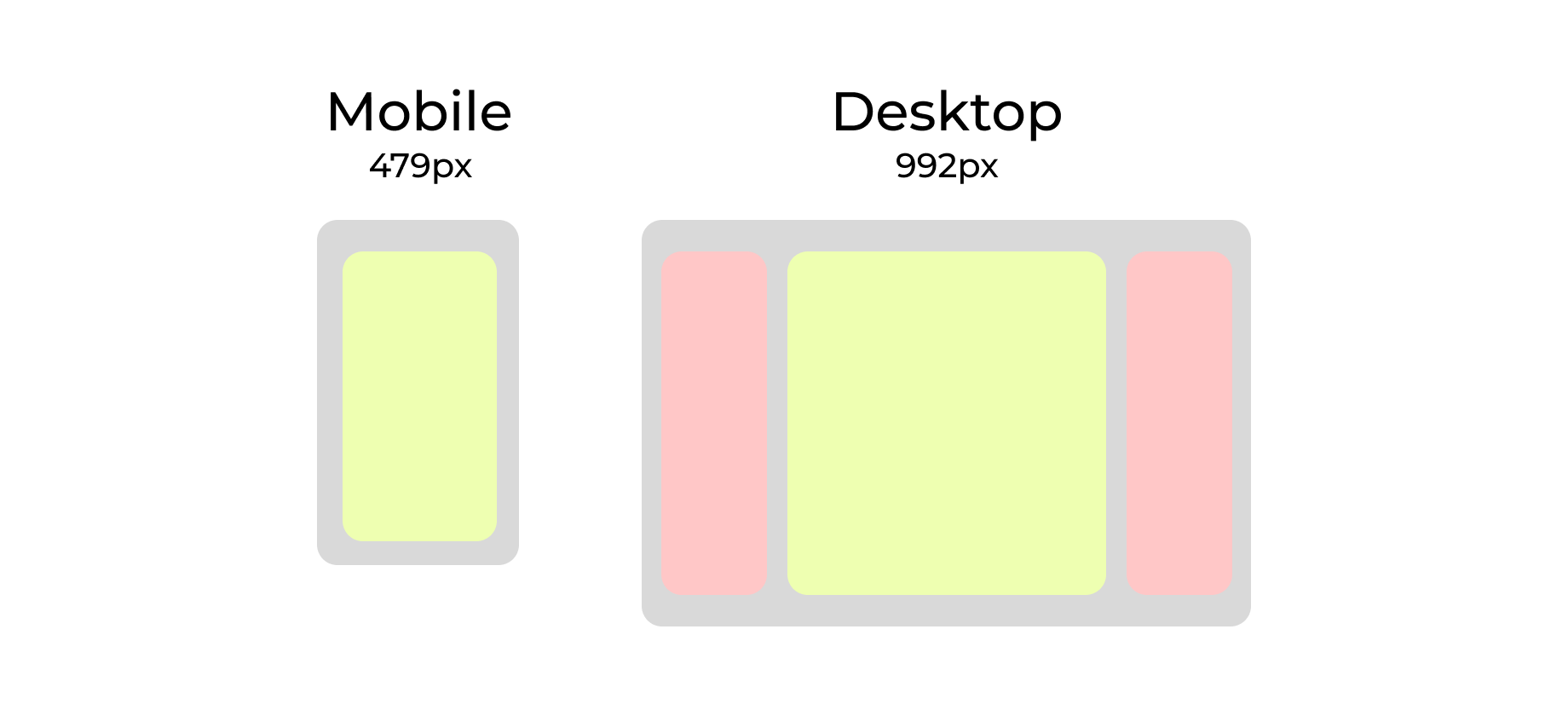
Responsiveness
Desktop breakpoint: 992px and up
Mobile breakpoint: 479px and below
On desktop, the layout can support multi-column structure, but content still follows a max width to keep line length readable. On mobile, the layout stacks into a single column and prioritizes the primary content and actions first.
Spacing
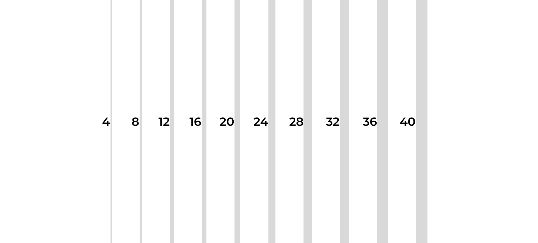
My mental model starts with 4. It’s a reliable base unit for layout because it creates consistent breakpoints and clean scaling. When you build spacing and sizing in multiples of 4, you reduce the chances of landing on awkward decimals, which can introduce alignment drift and occasional pixel rounding issues. It also makes grids easier to align, so layouts feel balanced, even, and intentional.
States
States: Every interactive element must have: Default / Hover / Focus / Pressed (at minimum).“Current page” styling should not rely on hover-only effects.
In order to create visual and interactive feedback, having states enables designs to guide the attention of the components. Color, motion and messaging are all important ingredients for creating accessible and consistent experience.
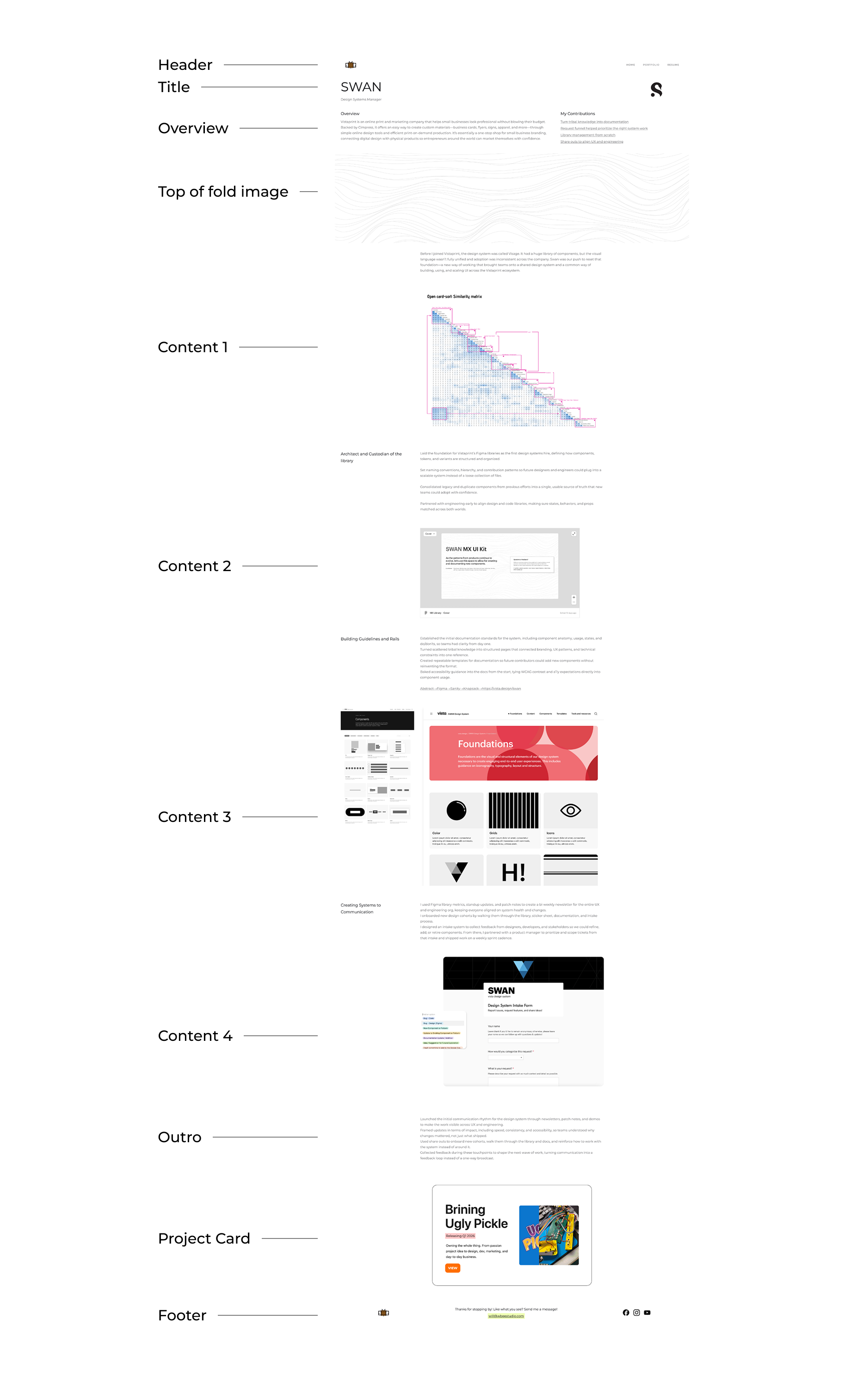
Template
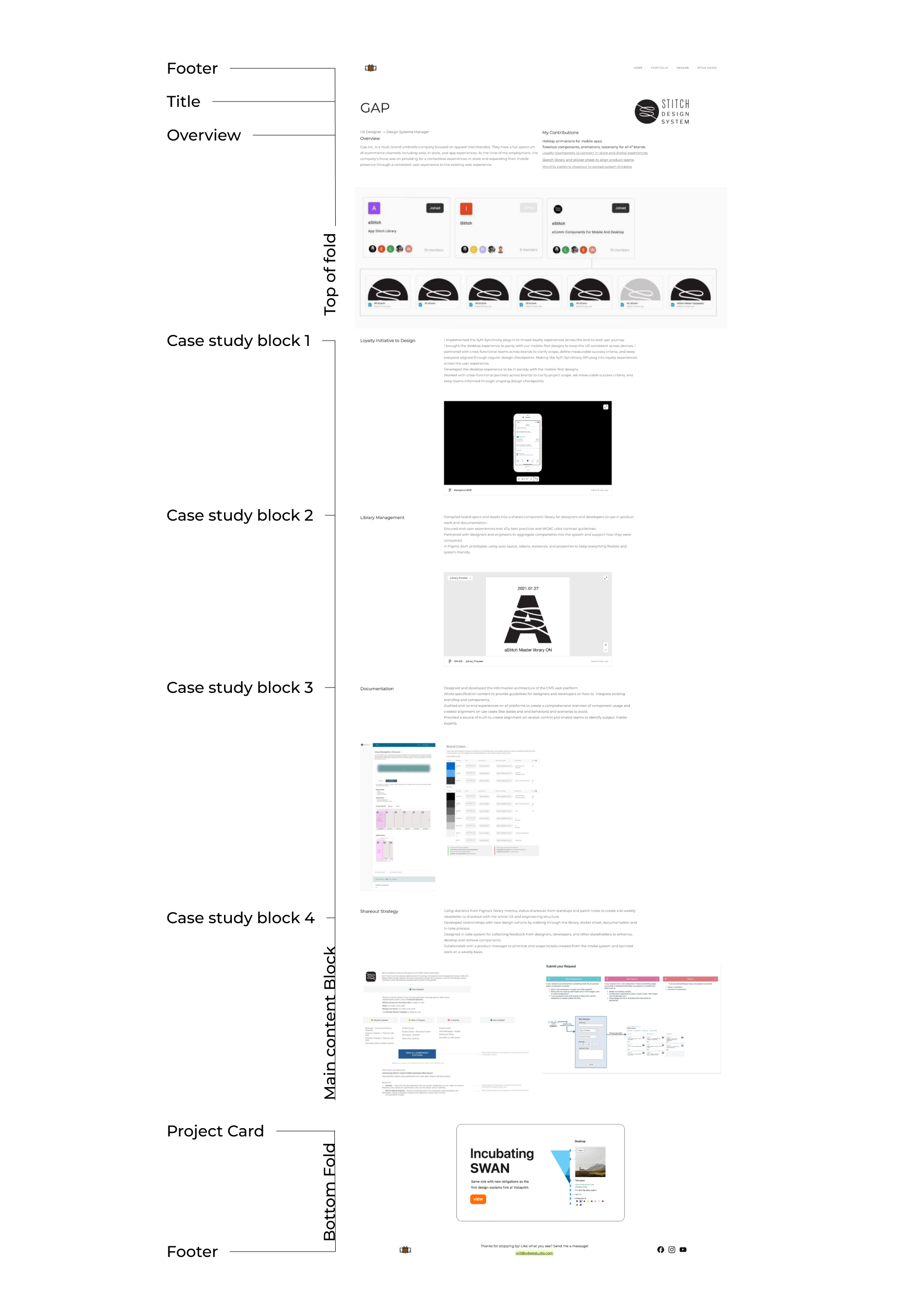
Every case study follows the same structure:
Top of fold (Header, title, overview)
Content (All of the case studies)
Bottom fold (next project card, footer)
Templates matter because they keep the work consistent and easy to scan. They remove the “blank page” problem, so I’m not spending time re-deciding structure every time I add a project. They also make the site feel like one system by keeping hierarchy, section order, and naming predictable across pages. That consistency helps readers compare projects faster, helps me avoid missing key details like scope, constraints, and outcomes, and makes the whole portfolio easier to maintain as it grows.
H1 Header text
H2 Header text
Hero text
hero text 2
hero text 3
Typography
title-display
title-subtitle
body
body-bold
Within this portfolio, the font family used is Montserrat.
Body text should use font weight by default. Use semi to emphasize specific content. Avoid usld for large paragraphs of text.

Voice and Tone
I am going to write this portfolio the same way I work. I keep it clear, direct, and easy to scan. I try to KISS (keep it simple, silly). I keep sentences short when the idea is important. I cut anything that feels like filler. I care about accessibility and consistency because that is what makes experiences feel solid. I care about systems because that is how good work scales. If you only read one section, you should still understand what the project was and why it mattered. If you read the full case study, you should understand how I think, how I make decisions, and how I work with others to ship.


