Vistaprint

Vistaprint helps small businesses design and order marketing materials at scale, which means the UI has to stay consistent across a large ecosystem of tools and product surfaces. I joined as the first design systems hire to reset the foundation of the system and make it usable in day-to-day product work. My focus was component quality, clear rules, and adoption workflows that made it easier for teams to build with the system instead of around it.
Role: Product Designer, Design Systems Manager
Team: 4 DS designers, 1 OPs Manager, 1 engineers
Surface area: mobile, web, internal, 99 Designs
Timeframe: 2021–2023
Primary impact: First DS Hire, Migration from Visage to SWAN
- Established the structure for Vistaprint’s Figma libraries, including component hierarchy, tokens, variants, and naming conventions.
- Consolidated legacy and duplicate components into one source of truth that teams could adopt with confidence.
- Built documentation standards and templates so usage, states, and do’s and don’ts were clear from day one.
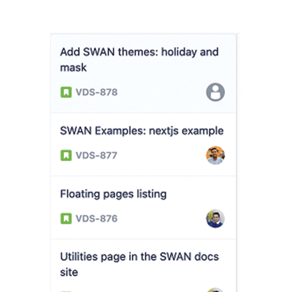
- Set up an intake funnel and prioritization workflow with PM to keep the system focused on the highest-impact needs.
- Created a communication rhythm across UX and engineering using newsletters, patch notes, and demos to drive adoption and reduce surprises.
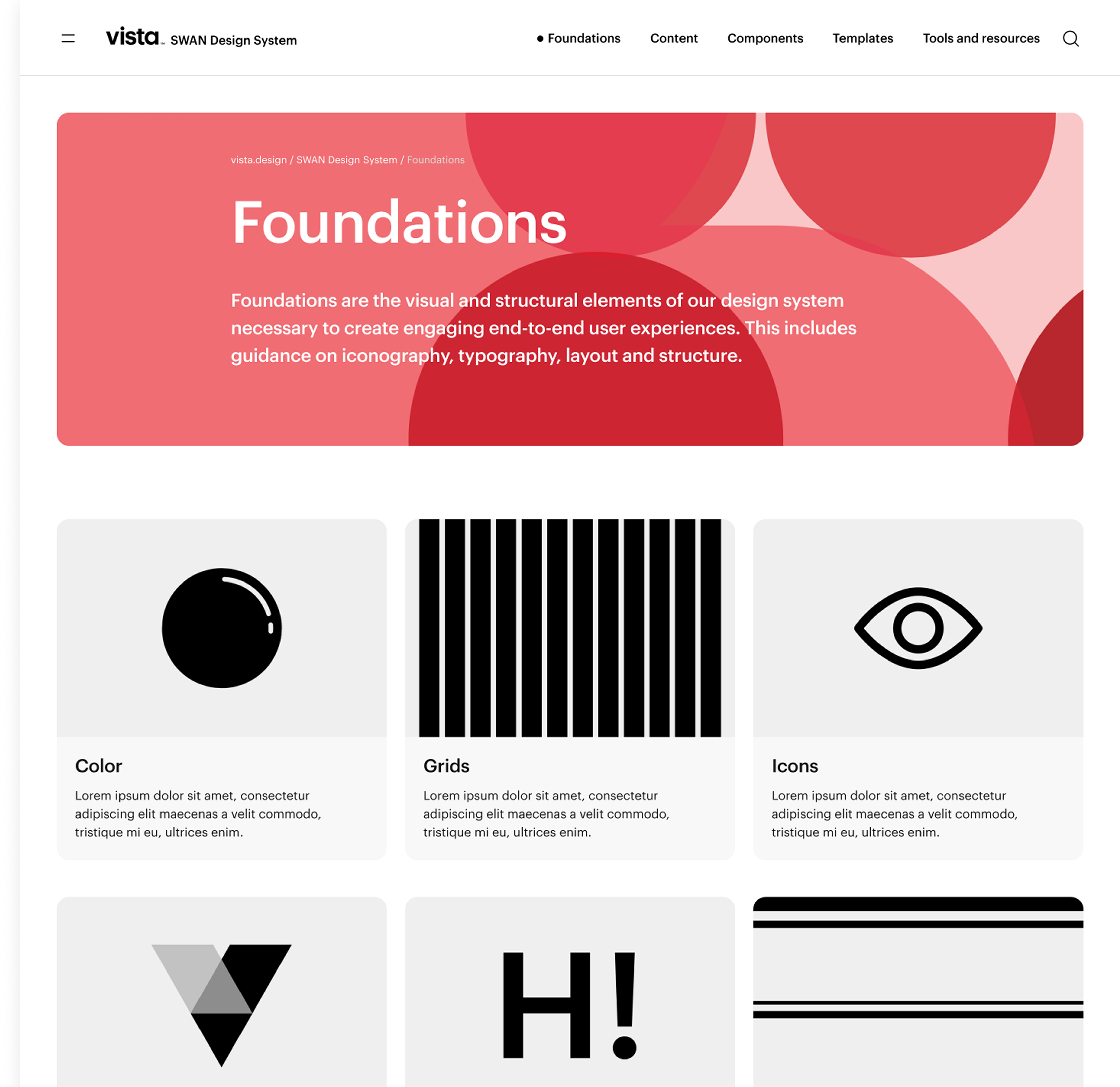
Before I joined Vistaprint, the design system was called Visage. The library was large, but the visual language was not fully unified and adoption was inconsistent. Swan was our reset. It aligned teams on a shared system and a shared way of building UI across the Vistaprint ecosystem, with clear structure, clearer rules, and a stronger path from design to code.
Architect and Gardener of the library

As the first design systems hire, I laid the foundation for how our Figma libraries were organized, structured, and maintained.
I defined naming conventions, hierarchy, and contribution patterns so the system could scale cleanly as more teams joined.
I consolidated legacy and duplicate components into a single source of truth, and partnered with engineering early so states, behaviors, and props matched across design and code.
Building Guidelines and Rails
I established documentation standards for component anatomy, usage guidance, states, and do’s and don’ts so teams had clarity from day one.
I turned tribal knowledge into structured pages that connected brand rules, UX patterns, and technical constraints in one reference.
I also created repeatable doc templates so future contributors could add new work without reinventing the format, and I baked accessibility guidance into the system from the start.
Abstract → Figma → Sanity → Knapsack →
https://vista.design/swanCreating Systems to Communicate
I treated communication like part of the product. I used Figma library metrics, standup updates, and patch notes to publish a bi-weekly newsletter for UX and engineering, keeping teams aligned on system health and changes.
I also onboarded new cohorts through a consistent walkthrough of the library, sticker sheet, documentation, and intake flow. Feedback from these touchpoints fed directly into the intake system, where I partnered with PM to scope and ship improvements on a weekly sprint cadence.
Launched the initial communication rhythm for the design system through newsletters, patch notes, and demos to make the work visible across UX and engineering.
Framed updates in terms of impact, including speed, consistency, and accessibility, so teams understood why changes mattered, not just what shipped.
Used share outs to onboard new cohorts, walk them through the library and docs, and reinforce how to work with the system instead of around it.
Collected feedback during these touchpoints to shape the next wave of work, turning communication into a feedback loop instead of a one-way broadcast.
I improved trust and adoption by making the system easier to use in real product work. Reduced duplication by consolidating legacy components, clarified states and behaviors through documentation, and created a predictable intake and communication rhythm so teams could build faster with fewer overrides.
It feels like pickleball.
A love letter to the sport, Ugly Pickle brings together everything I’ve learned over the years in a single box. Coming to Kickstarter in Q1 2026.


.png)
.png)
.png)

