Gap Inc.

Four brands. Eight platforms. Zero consistency. Gap Inc. was pushing hard on contactless and mobile growth—but each team was solving the same problems differently. I built Stitch to bring order to chaos:
a design system that unified experiences across Gap, Old Navy, Banana Republic, and Athleta while preserving what made each brand distinct.
After Effects Animations - BodyMovin
Team: 12 designers, 16 engineers, partners
Surface area: mobile, web, in-store, internal
Timeframe: 2018–2021
Primary impact: Built and managed 5 libraries across 8 brands, I tokenized core components, motion, and typography across four brands. This foundation enabled consistency while preserving each brand's personality.
- Shipped seasonal and holiday animation patterns for mobile apps.
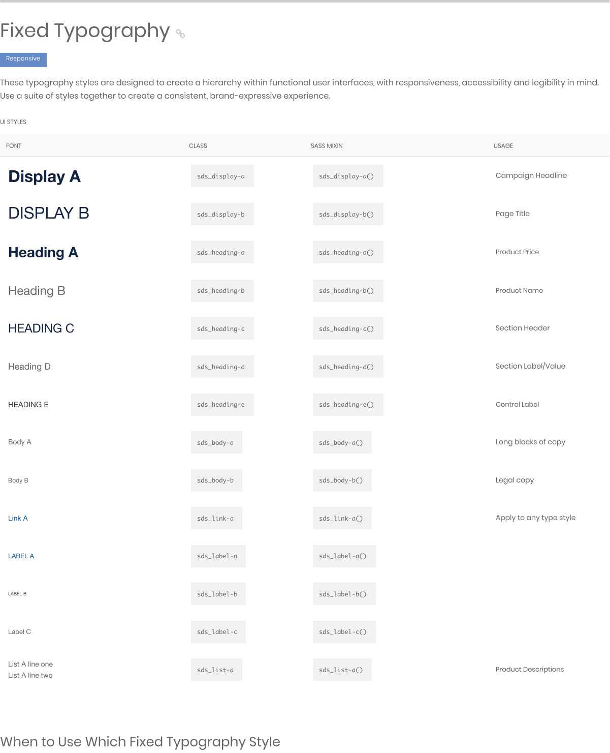
- Tokenized core components, motion, and taxonomy across four brands.
- Connected loyalty touchpoints across in-store and digital experiences.
- Built and maintained a shared Sketch and Figma library to align product teams.
- Ran a monthly pattern shareout and a bi-weekly newsletter to scale adoption and system thinking.
The Challenge: Fragments Across Four Brands
My work at Gap Inc. was primarily to manage four (to six) distinct brands. each with its own mobile app, web experience, in-store kiosks, and internal tools. Teams were duplicating work, creating drift, and slowing down velocity.
The business pressure was real: COVID had accelerated the push toward digital and contactless experiences. Mobile-first wasn't a nice-to-have. It was survival. In-store experiences needed to match digital. And speed to market became everything.
The opportunity: build the Stitch design system from the ground up, bring consistency without killing brand personality, and enable teams to move faster with less rework.
Loyalty: The Flagship Initiative
Loyalty was our highest-priority touchpoint. I designed the end-to-end experience across mobile apps, integrating with Barclay's rewards program and out of SyPi Synchrony to connect in-store and digital moments seamlessly.
I evolved navigation patterns and designed the product card quick-add feature for optimizing for mobile-first interactions while maintaining consistency across platforms.
We used the Barclay rewards integration to connect loyalty moments across the end-to-end journey.
I brought desktop flows up to parity with mobile-first designs so the experience stayed consistent across devices.
I partnered with teams across brands to define scope, set success criteria, and keep execution aligned through recurring checkpoints.

Library Management
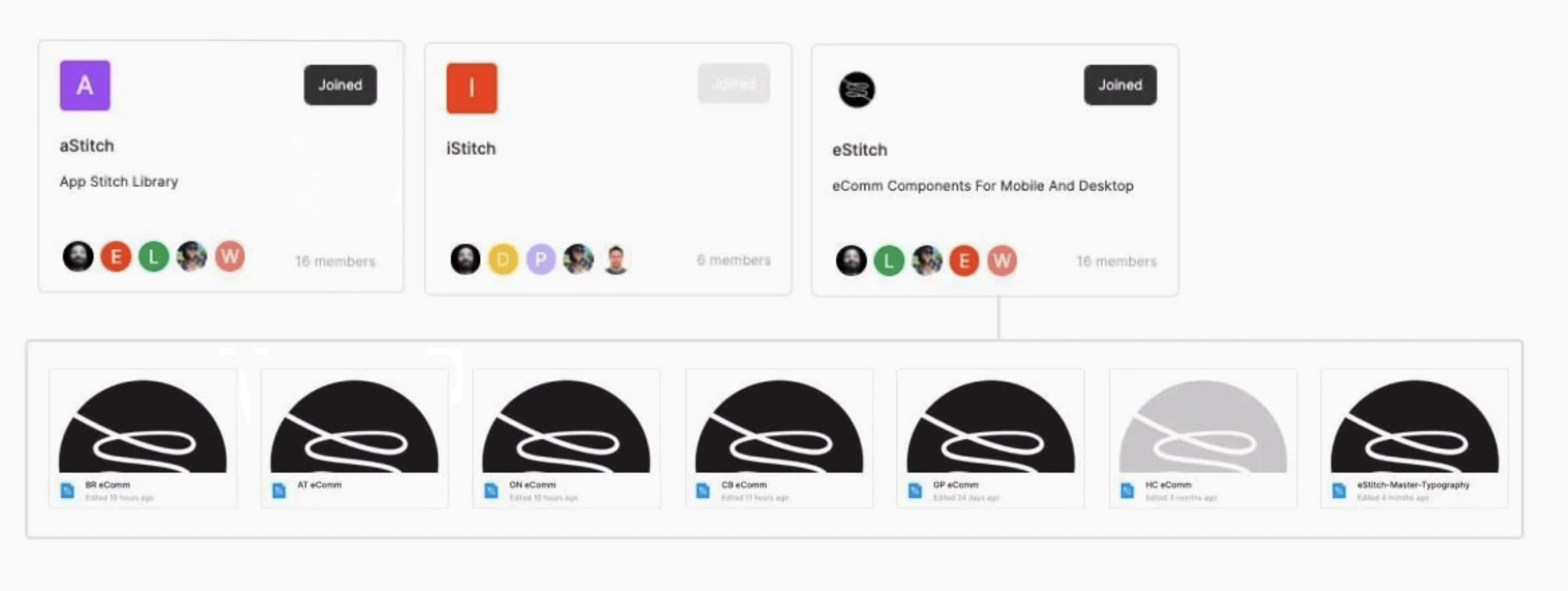
I consolidated brand specs and shared assets into a component library that designers and engineers could rely on in daily product work.
I built and maintained libraries for Old Navy, Banana Republic, Athleta, and Gap—each with brand-specific assets while sharing foundational patterns.
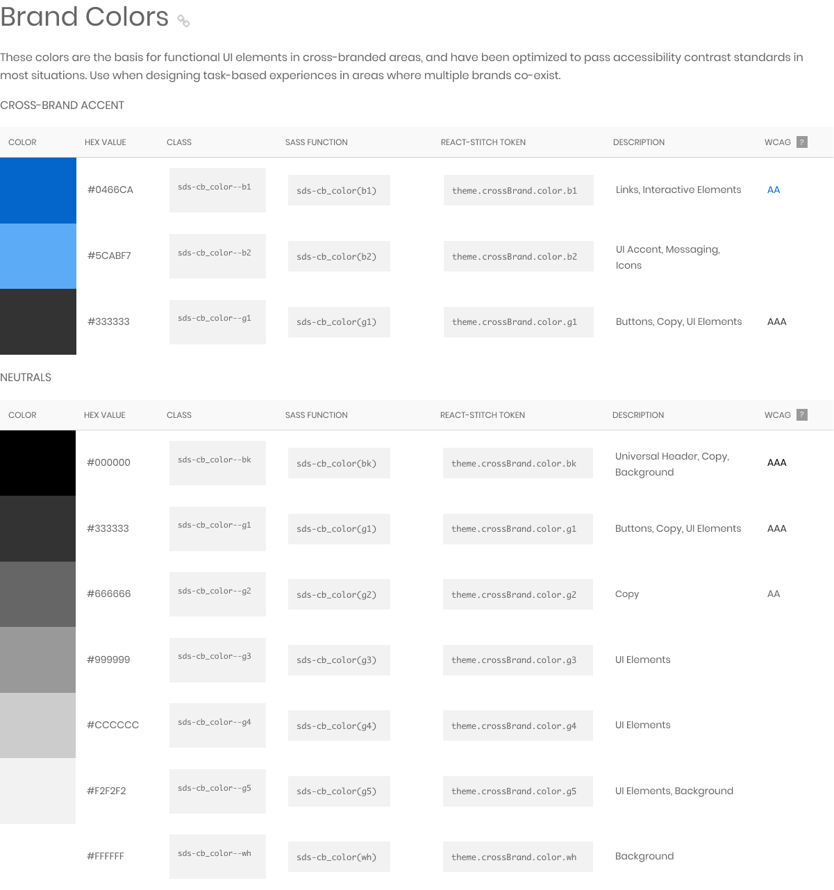
I set quality expectations around accessibility and contrast, and partnered with engineering to make sure components were consumable, not just documented.
In Figma, I built system-friendly prototypes using Auto Layout, tokens, instances, and properties so patterns stayed flexible and scalable.
Documentation
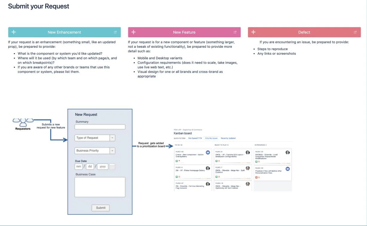
I designed the information architecture for the CMS documentation and wrote specs that translated brand and component rules into practical guidance.
I audited real product usage across platforms to clarify states, behaviors, and edge cases, then documented what to do and what to avoid.
The goal was a single source of truth that supported version control and made ownership clear.
I treated adoption like a product problem. I used Figma library metrics, standup updates, and patch notes to publish a bi-weekly newsletter for UX and engineering.
I onboarded new cohorts by walking through the library, sticker sheet, documentation, and intake flow.
I also set up an intake system for feedback and worked with PM to scope and prioritize tickets weekly.
I helped move Gap’s ecosystem toward a more consistent, system-driven experience across web, mobile, and in-store surfaces by doing the work that makes systems usable in real delivery. I tokenized components, motion, and taxonomy across four brands to reduce UI drift, brought desktop loyalty flows to parity with mobile-first designs through the SyPi Synchrony integration, and improved adoption with a shared library, clearer documentation, and a repeatable intake and communication rhythm.
Built and managed 5 libraries across 8 brands. Enabled 28 team members (12 designers, 16 engineers). Shipped components across mobile, web, in-store, and internal platforms. Reduced UI drift and accelerated velocity through shared patterns, clear documentation, and repeatable communication.
Visage to SWAN.
Designing the system behind the design system. Taking SWAN from infancy to maturity.


